I made two pages as I couldn’t decide which one Dianne would prefer for her book.
I took my inspiration from this moth mirror.

This is the first one I made and there is no way am I going to get a half decent photo with my skills, because of the reflection from the surface of the fabric.


It is on a backing of Kunin Felt covered with two layers of organza and a layer of net.
I traced the design onto water soluble transfer paper and stitched it through from the back. On a trial run, I was actually stitching from the front but found that however much I tried to dissolve the paper there was still a sticky residue left underneath the machine stitching.
After freehand machine stitching the piece I burnt it through with a soldering iron.
I backed the holes with a gold and a red metallic fabric. I originally made two faces from Sculpey and painted them gold but they seemed very heavy and clumsy so I printed the original design onto transfer paper and used those instead.
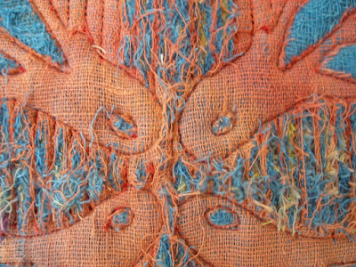
The second one is made from several layers of hand dyed scrim. Once again the butterfly pattern was machine stitched from the back and then I machined rows of stitching ready to slash.
I slashed right through the layers for the stripes and just took off the top layer of scrim for the butterfly shape.


And now it's up to Dianne as to which one she would prefer!


14 comments:
Wow Lynda, these are both awesome. I wouldn't be surprised if Dianne puts both in her fabric book.
They are both so very different and yet both so beautiful. I would have a very hard time deciding which one I wanted!
They are both very beautiful.
But if I had to choose, I would go for the second one...
fantastic I love them both I think Dianne wil have the 2 pages in here book
These are fantastic! I wish I was in your swap group!
Well Lynda just wait while I pick my chin up off the floor.
You are incredible -to put so much effort into not only one but two pages.I know Dianne will be thrilled and it will be hard for her to choose.
Go to the top of the class girl.
you got to shae with us when Dianne does see them! They are going to tally blow her away like they have all of us! Amazing is not good enough word for this! She will treasure both!
WOW Lynda,you are totally amazing!! Oh my, how can I chose?! Surely not both of these are for me - I only chose one right? How can I have 2 absolutely stunning pages - how can you spoil me so much?!!!!
Interesting and fascinating as always! For me, page 2 has the edge.
Wow, I don't know which I like the best. I love the colors and texture of the 2nd one, but for the Art Nouveau theme, I'd say you hit it with the first one.
Absolutely gorgeous both of them. Lucky Dianne.
Hugs, Alis
Both look ABSOLUTELY FAB in the piccies online, so I can only begin to imagine how wonderful they look in person. Lucky Dianne :)
Lucky Dianne, I think this will be very hard for her too chose. They are both really lovely and really art-noveau. Great job!
exquisite!!!
Post a Comment