The first piece of ‘Samurai’ I studied in depth was the helmet (known as Kabuto) which was predominantly black and indigo blue, with a bit of white, old gold and light brown thrown in.
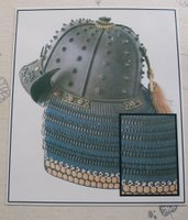
I’ve made some colour studies on these colours but I didn’t want to stick to just these two (black & indigo) main colours for my first assessment piece so what I have done is looked at the Samurai colours as a whole.
I’ve taken copies of some of their woodcarving prints (such as the ones that appear on the front of my research project book) and made various colour studies from these.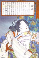
They would have used natural dyes to dye the silk for their undergarments and the Kumihimo braids used to bind the armour together. Madder was the favoured colour but Indigo is the most commom, mainly because the madder rotted the silk very quickly.
I have tried some experiments with natural dyes: Madder, Weld, Fustic Chips and Turmeric using different mordants: Chrome, Tin. Iron, Copper and Alum.
These are all dyed with madder.
The two samples below are both dyed using Alum as a mordant. I used more madder on the second one which seemed to make a slight difference.
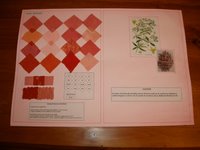
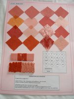
The samples below are dyed using Tin (left) and Iron (right)as a mordant.
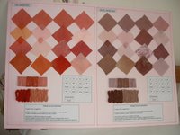
The samples below are dyed using Crome (left) and Copper (right) as a mordant.
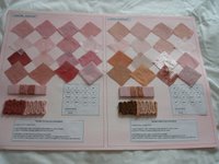
I have mounted these on watercolour A2 paper and have coloured washed the background to compliment the dye colour. I may take them off here and mount them in the sketchbook along with the other colour study work.
I cannot seem to get the madder to be a deep enough red. I’m going to have another go by using less water and also over dyeing a number of times.
I’m also going to try Cochineal but at £6.00 for 25gm. It’s a tad expensive to just experiment with.
I may have to resort to acid or Procion dyes to get the colour I want eventually.
I have been buying the natural dyes from Fibrecrafts. Their service is very good and their catalogue is packed with hints & tips.
I’m worried too that I’m concentrating too much on a deep red shade, which just happens to be one of my favourite colours!
I made this book cover, (unfinished of course!), about 5 years ago, and I still like it even now – amazingly! It is a much deeper red than it looks in the photo.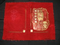
And if you look around my home you will see how much I love this colour!!
2 comments:
Love tthis book cover! Can you explain a bit more how you did it? Colours are gorgeous
Red has always been my favourite colour, but I very rarely use it in my work.???
Your colour studies are beautifully set out.
Post a Comment