Thursday, November 30, 2006

More Books

Another new book courtesy of Amazon - 'The Art of Embroidery' by Francoise Tellier-Loumagne.
There is a review in this months Stitch magazine of this book so I am going to 'borrow' a bit of their blurb.
'This is a breathtakingly beautiful book. The inspirational photographs and the work derived from them are stunning. Designs, worked in both hand and machine stitching are both sublimely simple – and simply sublime. A visual treat you’ll return to again and again; if I could only buy one book this year, this would be it’.
I certainly endorse everything they say and this also applies to her other book, pictured below, which I also happen to have in my collection titled ‘The Art of Knitting’.


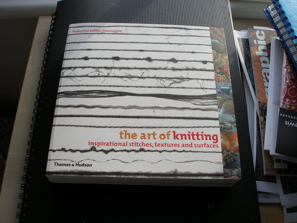
I think these must be two of the most inspirational books I have bought this year.

Two more of my subscription magazines arrived this week.
The first..

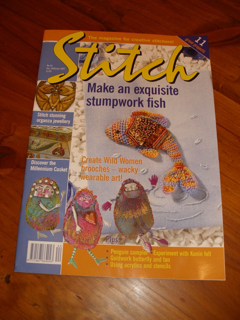
I have subscribed to this magazine since issue 1. It went through a stage where it was a bit basic but most of the articles now tend to be much better. There is a really good one this month about melting Kunin felt – called ‘Meltdown’ by Wendy Cotterill and the ‘Wild Women’ pictured on the front are awesome. You can also read the full review of 'The Art of Embroidery' book.

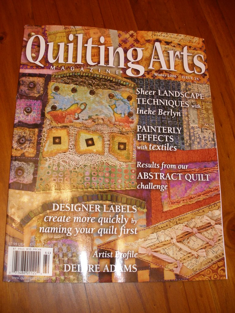
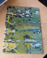
The next one to pop through the letterbox was..


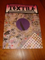
The content of this magazine is always really good. There are always so many inspirational colour photographs. I would just love to go to one of the forums they advertise.

A few posts ago I mentioned this book:


Breakdown Printing by Claire Benn and Leslie Morgan which I bought at Ally Pally.
Well, having a sort out at the weekend I discovered I actually have two copies of this book! (Unfortunately, this isn’t the first time this has happened)
Anyone as it’s coming up to the festive season, and I am feeling very generous, the first person to get in touch – it’s yours!

Late addition - 30.11.06 4.45 p.m.
This was waiting for me when I got home from work.
Another brilliant magazine.
Haven't even looked inside yet, but I can tell from the front cover it's going to be a really good one again!

Monday, November 27, 2006

Drawing Practise

My tutor, Sian Martin, suggested that I practise my drawing technique. I’m afraid this is one of my downfalls. I have been trying to draw from a still life object following the exercises recommended by Sian – it hasn’t been easy. When I’m brave enough I shall post some of them here.
In the meantime, after a posting about another fairy book, I got this book out yesterday and decided to have a go.


Here are some of my efforts.


I then went on to draw and paint this in watercolour.


Are you thinking at last a still life?

Wrong I'm afraid – it’s from the Laura Ashley wallpaper in the spare room! :)


It took me most of the day, on and off, to do all these. The phrase ‘displacement activity’ keeps springing to mind!!!

Sunday, November 26, 2006

Bushclover Part 2

Uncomplicated and modest designs such as the bushclover pattern were considered politically correct during the Heian period in Samurai history.


This photo shows the first three rows of ‘scales’ drawn directly on the page, the next two are cut out and glued down and the final two are free standing.


In this photo I have placed the scales differently. Normally they would overlap upwards to give added protection to the warriors. On the left they are still overlapping upwards but each of the rows covers the one underneath. On the right they are overlapping downwards.


These scales have all been made separately before assembling from two layers of tissue paper, crumpled then glued together. A strip of cartridge paper was put along the edge for stability. I used metal eyelets and viscose tape to join. I have threaded the tape through in one piece from top to bottom as per the detachable sleeves.


This piece was also made using two layers of tissue paper. The bushclover pattern was drawn on in oil pastel crayons before applying a coat of acrylic ink followed by a coat of acrylic wax. Gold thread was used in one continuous join as above. The close up shows the bushclover pattern. Not too sure about this one, I think it looks a bit heavy. I prefer the simplicity of the white, red and black samples.


This piece is another A1 size mock up as in the 3D model I made before. It’s pieces of card cut in the shape of scales, a strip of card glued down the side to strengthen and then all of them glued on to a piece of mount board. Before I decorate it I must decide which way up I want to work…


...this way or ...


...this way…

.. .and then try out some different techniques – not ink and bleach again!! Any suggestions welcome.

Saturday, November 25, 2006

Modroc

I mentioned Modroc in one of my recent posts and several people have asked me exactly what it is – and I don’t think it was anything to do with the fact that I spelt it wrongly!

Modroc is scrim that has been impregnated with plaster. From what I understand this is the material used years ago for plaster casts to mend broken limbs. It’s fairly lightweight and robust. If painting, its best to brush on a layer of gesso first as the surface is quite absorbent.


These masks were all made from Modroc. I made them a few years ago as part of a theatrical costume course. The brief was to make a series of masks based on early twentieth century headwear to be displayed in a showcase in the foyer of the theatre to advertise the latest stage production. I made five masks in total and my main theme was the 1920’s.


This is my favourite. It took me ages to make the beaded fringe but I enjoyed every minute.


This photo hasn’t come out too well. Makes the mask look like an old man with a beard! This is knitted beaded wire. The top layer of organza is black, bottom layer blue. The mask was painted a deep blue then rubbed over with Treasure Silver.


The silk chiffon on this mask was dip-dyed in acid dyes.


Modroc can be modelled around a former. You can use wire, newspaper or in my case a glass head. If you were to use an absorbent surface as a former you would need to cover it in cling film or Vaseline first.
Estimate the amount of material needed and cut into smaller workable strips. You need about 3 layers but if you find that your model is a bit uneven in places when you remove it from the former, you can always add more.


You need a shallow tray of water to immerse the modrock in. Modroc absorbs moisture so you need to keep the unused material away from water or moisture in the air. Make sure the water is clean as setting time is affected by this as is the temperature of the water - cold water slower, warm water quicker. You can speed up the drying out time with a hairdryer.


Immerse a strip of modrock in the water for 4 – 5 seconds.


Lift out of the water and run through the fingers to squeeze out the excess. Do not wring out – you’ll end up with a tangled up piece of material.
Start layering the pieces on your former. Work one area/layer at a time because after 3-4 minutes it will be unworkable. Place it on and rub all over with your fingers to get a smooth finish.


This finished piece below has had 3 layers.


After about 10 minutes I removed the mask from the former. When it is completely dry I will sand the edges and then decide how to decorate.


This is a very messy technique but is great fun with good end results.

Friday, November 24, 2006

Bushclover Part 1

I have been working on the bushclover pattern that I used for the lino printing pieces. Below are some of the samples I have produced.

These patterns have been traced on to handmade paper and coloured in with acrylic inks in a marine blue, flame red and an Indian yellow. The outer edges were dampened then black acrylic ink was brushed along the wet edge.


I have been looking at the scales of the armour plate and the kumihimo cord bindings which held them together.


This is the lacing on the underside of the detachable armoured sleeve (kote), made with a single cord.


The scales were made of lacquered leather. The most popular material to use was wild dog skin. I cut mine out of card!!!

These three have all been finished in different ways. The colours are not right, I used what I had at the time, it is the finish that I was trying to achieve.


The first one has the bush clover pattern cut from foam and glued on the top. Oil pastel crayon was then applied thickly on the shapes. I wanted this to act as a resist but the acrylic paint was applied too thickly and covered the oil pastel completely.


The second one also has the raised pattern cut from foam. Once glued on, tissue paper was then glued over the top, painted with acrylic inks then rubbed with treasure gold. The colours on this one are totally wrong but I do like the texture.


This close up shows more of the texture.


The last of these samples was first painted with acrylic. Tissue paper which had the bush clover pattern drawn on in oil pastel was stuck on top while the paint was still wet then a light wash of the same colour acrylic was brushed over the top.


Thursday, November 23, 2006

Away With The Fairies

Now, anyone that knows me will tell you that no way am I frilly, fluffy or twee. O.K. sometimes I go misty eyed over fabric, threads and books but generally its both feet firmly on the ground.
BUT the one thing that can bring me to my knees are these little people…


…in all their different guises.Why? I just don’t know!

Just happened upon this book by chance, ordered it straight away from Amazon and it came yesterday – all ready to go on the shelf with my other one or two (OK make that 11) fairy books!

My particular favourites are the Brian Froud books, especially 'Lady Cottingtons Pressed Fairy Book' and the book Fairie-ality is just amazing. You really must take a look at these two links!

In my defence, I would like to point out that I only like them on paper – I don’t do ornaments, accessories or stuffed versions!!!

Wednesday, November 22, 2006

Ink and Bleach Samples

These samples were supposed to be for the exercise in Module 1 – Transforming with Media. It wasn’t until I posted up the Gesso samples and was typing in the exercise instructions when I realised that perhaps these were not really transforming with different types of media but more like colouring with different types of media. I seem to have got carried away with the ink and bleach theme. I shall still keep them with the other samples as I am sure they will fit in somewhere along the line.


Ink and Bleach samples sheet 1


Muslin with twin needle stitching. Drawing ink applied then randomly bleached. I did not like the effect this produced so quickly rinsed sample in water hoping to save it but decided I liked the 'washed out' look.


Ink and Bleach samples sheet 2


Wire stitched onto muslin in one direction only and held in place with zig zag stitch. Writing ink applied then randomly bleached. The wire in this piece would allow it to be moulded into shape.


Close up of above piece, back view.


The calico was wetted first before drawing ink was applied. While the ink was still damp a pattern was stencilled on with bleach. When dry, organza was placed over the top and held with twin needle stitching. Piece was then 'zapped'.


Ink and Bleach samples sheet 3


Drawing ink applied to muslin, bleach brushed on randomly then brushed over with writing ink. Backed with another piece of muslin before rows of twin needle stitching.


The silk velvet was wetted before drawing ink was applied. While the ink was still damp a pattern was stencilled on with bleach. Writing ink was then applied on top, left a few minutes (otherwise the bleach tends to rot the silk) then washed through. Backed with a piece of muslin before rows of twin needle stitching.


Ink and Bleach samples sheet 4